
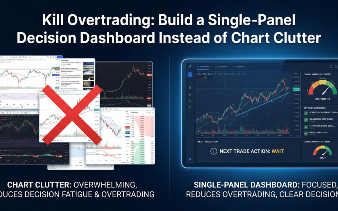
You already know the chart that gets you in trouble. Three EMAs fighting for space, RSI dipping in and out of overbought, an ATR reading you glance at but never actually use, and maybe a couple of trendlines you drew last week and forgot to delete. None of it is wrong exactly. The problem is you’re staring at six separate opinions and calling it ‘analysis.’
Overtrading rarely comes from a lack of information. It comes from too much of it, arriving in a format that forces you to make a judgment call every single time you look at the screen. Every extra indicator is another decision point, and every decision point is another chance to talk yourself into a trade that shouldn’t exist.
Why More Indicators Means More Hesitation, Not Less
Each indicator on your chart is answering a narrow question. RSI tells you about momentum exhaustion. ATR tells you about volatility. Moving averages tell you about trend direction, sort of, with a lag baked in. None of them tell you what to actually do right now, in this market, at this level.
So your brain does the integration work manually, in real time, under pressure, every time price approaches a level. That’s exhausting, and tired decision-making defaults to impulse. You see RSI oversold, ignore that structure is still bearish, and take a counter-trend scalp because you’re bored of waiting. That’s not a strategy failure. That’s decision fatigue dressed up as a trade idea.
The Fix Isn’t Fewer Indicators, It’s One Output
You don’t need to strip your chart down to naked price action if that’s not your style. What you need is to stop treating each indicator as an independent signal and start treating them as inputs into a single, pre-defined readout. Think of it less like a chart and more like a cockpit gauge.
A decision dashboard takes the same data you’re already tracking and compresses it into a handful of plain-language states, checked in the same order every time:
- Market state: is price structure currently bullish, bearish, or ranging?
- Momentum: is it strong, fading, or neutral relative to recent swings?
- Volatility: is the current range expanded, compressed, or average, so you know whether a breakout has room to run?
- Location: is price at a level worth reacting to, or in the middle of nowhere?
Notice what’s missing: no raw numbers to interpret, no lines to eyeball. Just a state. When all four line up in the same direction, you have a trade worth considering. When they don’t, you already have your answer: wait.
Structure First, Everything Else Second
Here’s where most homemade dashboards go wrong. People build a panel that averages together a bunch of lagging indicators and still end up with a mushy, contradictory readout, because none of the inputs actually define where price is in its structure.
Market structure, the sequence of higher highs and higher lows, or the break of a range, or a failed retest of a swing point, is the thing everything else should be filtered through. Momentum and volatility readings mean something different in a clean uptrend than they do inside a chopfest between two levels. If your dashboard doesn’t start with ‘where are we in the structure,’ the rest of the panel is just noise wearing a nicer outfit.
That’s the whole premise behind building tools like this around structure rather than around a stack of generic oscillators. A momentum reading that fires inside an established range should be treated completely differently than the same reading firing on a break of structure with expansion behind it. One is a reversal setup. The other is a trap.
What This Actually Looks Like on the Chart
In practice, a single-panel setup means you stop scanning five different windows and start reading one block of text or color-coded labels, updated on every candle close. Bullish structure, strong momentum, expanding range, price at a retest level: that’s a green light. Ranging structure, neutral momentum, compressed volatility: that’s a stand-down signal, full stop, no debate.
The value isn’t just speed. It’s that the panel forces consistency. You check the same four things in the same order every time, which means your entries stop depending on your mood, your sleep, or how many losing trades you just took. The rules don’t change because you’re annoyed at the market.
Building One Without Overengineering It
If you’re doing this yourself in MT4 or MT5, resist the urge to cram in every indicator you own. Start with the smallest set of structure-based conditions that actually change your behavior:
- A clear definition of trend based on swing highs and lows, not just a moving average slope
- A momentum filter that only matters near key levels, not in the middle of a range
- A volatility check so you know whether a breakout has statistical room to move before you chase it
Test the panel against your last thirty trades before you trust it live. Would it have kept you out of the impulsive ones? If yes, you’ve built something useful. If it still gives you a green light on the trades you regret, the logic needs tightening, not more indicators bolted on.
The Real Win Is Fewer Trades, Not Better Ones
A good decision dashboard won’t necessarily make your winners bigger. What it will do is cut the volume of marginal trades you take out of boredom or anxiety, the ones that chip away at your account between the actual A-setups. Less noise, fewer decisions, more patience for the setups that were worth trading in the first place. That’s the entire game.