
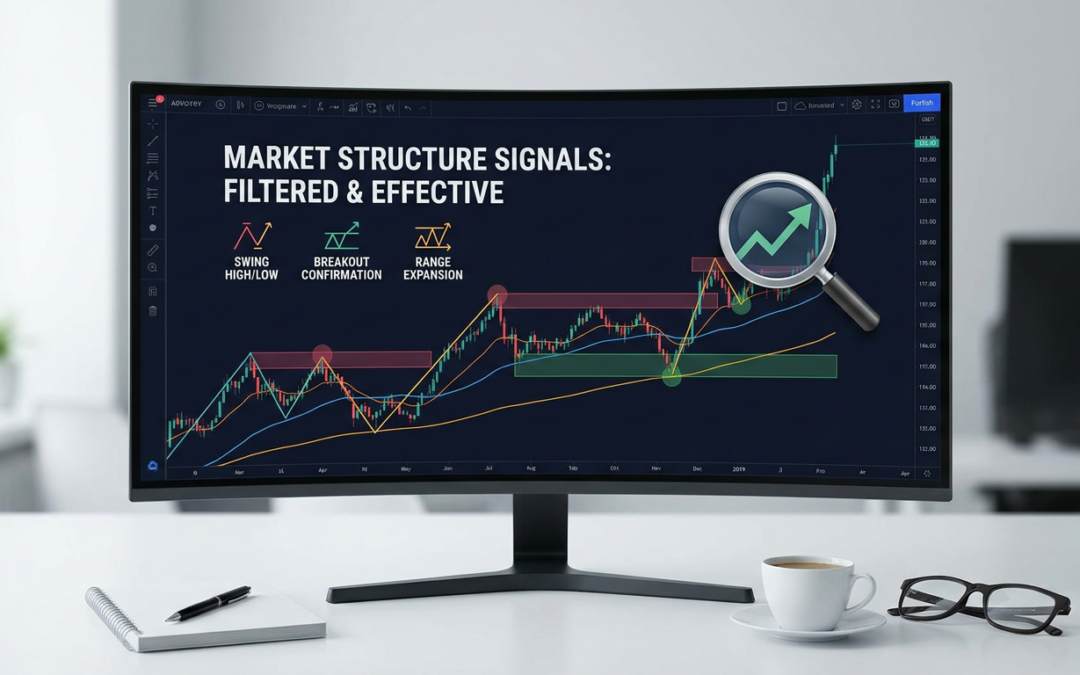
Every year someone publishes a ’10 best indicators for beginners’ list, and every year it’s the same recycled lineup: RSI, MACD, Bollinger Bands, a moving average or three, stacked on top of each other until the chart looks like a control panel. None of it tells you what price is actually doing structurally. It just gives you more lines to stare at while you make the same mistakes with extra confidence.
Market structure trading works differently. You don’t need ten indicators. You need a handful of tools that answer three questions: where is price in its swing cycle, is this move likely to expand or fade, and has a level actually been broken or just wicked. That’s it. Everything else is decoration.
Why the generic indicator lists fail structure traders
Most beginner-focused lists are built for a different job: catching momentum or timing entries in isolation. They’re not built to tell you whether you’re in a range, a trending leg, or a failed breakout. Stack five lagging oscillators on a chart and you’ll get five slightly different opinions about the same move, none of which reference the actual swing points that define structure.
The fix isn’t more indicators. It’s fewer, better-chosen ones that map directly onto how price actually moves: in swings, in ranges, and in expansions out of those ranges.
1. A proper swing structure tool (not eyeballing highs and lows)
This is the non-negotiable base layer. You need something that objectively marks higher highs, higher lows, lower highs, and lower lows, and flags the moment that sequence breaks. Doing this by hand on every pair, every session, is slow and inconsistent, which is exactly why most traders skip it and end up trading noise.
A dedicated swing structure indicator does the labelling for you and, critically, flags the break of structure (BOS) or change of character (CHoCH) the second it happens rather than three candles later. That single piece of information, is this swing sequence intact or broken, matters more than every oscillator combined.
2. Average True Range (ATR), used for context, not entries
ATR gets lumped into generic lists as a ‘volatility indicator’ with no real explanation of what to do with it. Used properly, it tells you whether the current range is contracting (setting up for expansion) or already stretched (setting up for exhaustion).
Compare current ATR against its recent average. A range that’s been compressing for several sessions and suddenly starts expanding is exactly the environment where breakout and reversal setups play out cleanly. Trading breakouts without checking ATR first is how you end up buying a move that’s already 3x its normal daily range.
3. A session or range-mapping tool
Range expansion trading depends on knowing where the range actually is. An Asian session range indicator, or a simple prior-day/prior-week high-low marker, gives you the box that price needs to break out of. Without it, ‘breakout’ becomes a subjective guess instead of a defined level.
This matters more for index and forex traders than almost anything else on this list, because so many of the best reversal and breakout setups form directly off session range boundaries: the London open sweep, the New York reversal off the Asian high, and so on.
4. Volume or tick volume, for confirmation only
Forex doesn’t have centralized volume, but tick volume is still useful as a rough proxy for participation. The job here isn’t to generate signals, it’s to confirm or deny what the structure and the breakout are telling you. A break of structure on rising tick volume carries more weight than the same break on a dead, illiquid session.
Use it as a filter, not a trigger. If your structure tool flags a break but volume is flat, treat it with suspicion rather than trading it blind.
5. Clean supply and demand or key-level marking
Support and resistance zones only matter if they’re drawn from actual structural pivots, not arbitrary round numbers. A tool that automatically plots zones from validated swing highs and lows keeps you honest and stops you from redrawing lines to fit whatever trade you already want to take.
Combined with the swing structure tool from point one, this gives you the full map: where the swings are, where the key levels sit, and whether price is respecting or violating them.
6. Momentum divergence, but only at structural extremes
RSI or a similar momentum tool has one legitimate job in a structure-based approach: spotting divergence at a swing high or low that’s already been flagged as significant. Used standalone, RSI is noise. Used to confirm exhaustion at a level your structure tool has already highlighted, it earns its place on the chart.
The rule of thumb here: if the indicator’s signal doesn’t reference a specific structural point, ignore it.
What to strip off your chart
If you want to trade structure cleanly, remove anything that duplicates information you already have. That usually means:
- Multiple moving averages stacked for ‘confirmation’ that all say the same thing with different lag
- Two or more oscillators measuring the same kind of momentum
- Signal-arrow indicators with no visible logic behind the arrow
- Fibonacci retracements drawn on every single swing regardless of context
- Anything you can’t explain the calculation of in one sentence
Clutter isn’t just visually annoying, it actively slows decision-making. When five things are technically ‘signalling’ but disagreeing, you hesitate on setups you’d otherwise take with confidence.
How it fits together on a live chart
In practice the workflow looks like this: check the swing structure tool to see if the trend is intact or has just broken, check ATR to see if the range is compressed or stretched, check the session range to see if there’s a defined box to break out of, and only then look at volume and momentum for confirmation. Five tools, one clear picture, no guessing.
This is exactly the logic we build into our own MT4 and MT5 tools: structure detection, break-of-structure alerts, range and expansion mapping, all designed to strip out the noise instead of adding to it. If you’re tired of charts that look like a cockpit and still don’t tell you what price is actually doing, that’s the gap these tools are built to close.